Tuesday, January 27, 2015

The Non-Contending Contenders

I picked our school's mock Caldecott nominees based on, as I said before, personal preference combined with online buzz.  I had to leave out at least some of the most-talked-about possible winners.  But I also left out two books that haven't been talked about anywhere but are two of my 2014 favorites.


A Home for Mr. Emerson. Haven't you ever wanted to just dive into a book?   In this biography of Ralph Waldo Emerson, which centers on his home, the illustrator shows Emerson doing just that.  I love everything about this book - the text, the illustrations, and how they work together.  The oversized books which appear everywhere drive home the point that Emerson's home is not just the building he lives in, but the ideas, words and books he surrounds himself with, not to mention the nearby woods, and, most of all, a caring community of neighbors.  The use of different fonts for the text and for direct quotes from Emerson himself works especially well.  And despite the illustrator's very British-sounding name (Edwin Fotheringham), he is, indeed, a U.S. resident, making this book Caldecott-eligible.  There's a great interview with him here.


Mr. Ferris and His Wheel. The color palette of vivid blues, golds, chartreuses and purples bring to life a world recently lit up by electricity. Together the text and the illustrations also convey the excitement associated with all sorts of new technology, embodied by the World Fair, and all kinds of races to build the next biggest and/or best thing.

Of course, since there are no nominations for the real Caldecott, no short list, these two ARE contenders.

Friday, January 16, 2015

My Caldecott Votes

Art is a matter of personal taste.  There's no getting around it.  Sure, you can judge artists based on technical mastery, but when you have talented artists working in different styles, media, and palettes, a lot comes down to personal taste.  Which is why awards like the Caldecott are so interesting.  The committee members who award the Caldecott change every year, which means that, while there's no predicting who will win, different types of art and artists are given a chance.  It also means knowing that if only the committee from year X judged in year Y, the line-up would be completely different.

So what follows is my take on our school's mock Caldecott nominees.


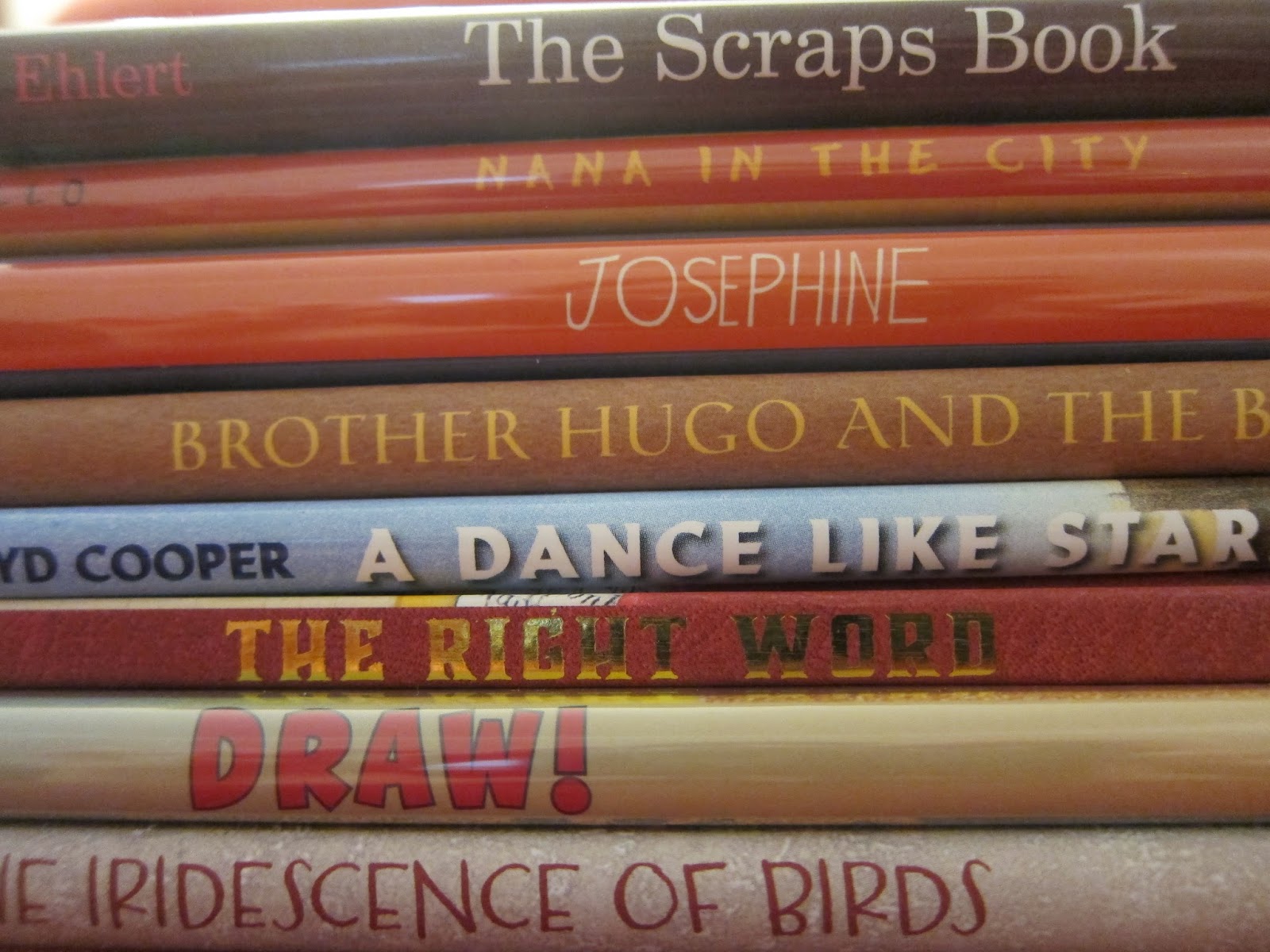
The Right Word: Roget and His Thesaurus by Jen Bryant, illustrated by Melissa Sweet.  Sweet's work is always beautiful and intricate.  I recently went to the Original Art exhibit at The Society of Illustrators and one of her works for this book was shown.  It had so much layering and depth in person, it was astonishing.  I love how she incorporates synonyms and words into her collages.  But I keep hesitating.  There's something about the art here that seems a little too busy, a little distracting.  Unlike her work in Firefly July, which is simpler and more pure, somehow, or her work in Brave Girl, which her collage style fits perfectly, given that the story is about the garment industry.  Finally, I know this is not supposed to be a consideration, but there's something that bothers me when an illustrator's work feels repetitive.  It is nice - especially for children - to be able to recognize an illustrator's work at a glance, but sometimes it feels unoriginal.  


Draw! by Raul Colon.  Technically lovely, this style - and palette - do not appeal to me.  I can't cite a specific reason!

Nana in the City by Lauren Castillo. I love this one!  I love how the playful, almost childlike style complements the fact that the child is the narrator.  I also like how the illustrations add to the story; for example, when the grandma gives money to a homeless person, which is not explicitly mentioned in the text.  Her depiction of New York is beautiful but not completely idealized.  The buildings are so tall they literally cannot be contained on the page.  And the grandmother's relationship with the boy is so tender.

Flashlight by Lizi Boyd.  The use of the flashlight to illuminate areas of the pictures is ingenious but I feel like the use of cut-outs as well is overkill.  I feel like it actually takes away from the other elements.  

The Iridescence of Birds: A Book About Henri Matisse by Patricia Maclachlan, illustrated by Hadley Hooper.  This book has been growing on me.  The use of the blue-gray colors capture the drabness of where Matisse grew up and the contrast with the colors and patterns of the textiles he loved is dramatic.


Josephine: The Dazzling Life of Josephine Baker by Patricia Hruby Powell, illustrated by Christian Robinson.  When I saw this book, I had a sense of deja vu.  Where had I seen it before?  It turns out I was thinking of another book illustrated by Christian Robinson, Harlem's Little Blackbird, a biography of Florence Mills, which treats a similar topic and uses a similar color palette.  Which brings me to the same complaint I had about Melissa Sweet's work.  Can you tell which picture above is from which book?  Nevertheless, I love the colors - mustardy yellow, mossy green, persimmon orange.  The use of different fonts here is stunning and Robinson really captures a sense of movement and jazziness in still pictures.  This one might be my favorite!

The Scraps Book: Notes from a Colorful Life by Lois Ehlert.  Beautiful and so interesting.  My younger daughter says Lois Ehlert's books are boring but this book about how she makes those boring books is interesting!  But since it is an amalgam of her earlier work, a collage of collages in a way, I feel like it is lacking an element of originality that is award-worthy.


Viva Frida by Yuyi Morales and Tim O'Meara (photographer).  Okay, I know it's not a technical term, but this book creeped me out!   

A Dance Like Starlight: One Ballerina's Dream by Kristy Dempsey, illustrated by Floyd Cooper.  Painterly.  The expression on the girl's face is one of sheer joy.  

Brother Hugo and the Bear by Katy Beebe, illustrated by S.D. Schindler.  Original with a wonderful incorporation of the style of medieval illuminated manuscripts which fits the text perfectly.  

So in the end, out of these, I think I'd rank Josephine or Nana in the City first, followed by The Right Word.  Tune in next time to find out what I think of other contenders that didn't make it into our school competition.

Monday, January 12, 2015

The Standings

So, after approximately a week of voting, here are the current standings.  I gave each book 3 points for each first-place vote, 2 points for each second-place vote, and 1 point for each third-place vote. Draw! is far in the lead and has been since the very beginning.  It has been very educational for me, seeing what appeals to the kids.  My order would be completely different!

Most of the votes so far come from second-graders.  They are old enough to understand the project and read the instructions, yet they are not in a "testing grade."  Sad to say, but that is certainly a factor.

In order of how they currently stand in the voting:

1.  Draw!: 75 points (14 first place votes, 12 second place votes, 9 third place votes)

2  The Right Word: Roget and His Thesaurus: 33 points (8 first place, 2 second place, 5 third place)

3.  Flashlight: 31 points (4 first place, 8 second place, 3 third place) (This one moved from a distant last place at the end of last week.)

4.  Nana in the City: 30 points (4 first place, 6 second place, 6 third place)

5.  Josephine: 28 points (5 first place, 4 second place, 5 third place)

6.  Viva Frida: 27 points (6 first place, 3 second place, 3 third place)

7.  Brother Hugo and the Bear:  26 points (4 first place, 5 second place, 4 third place)

8.  The Scraps Book: 25 points (3 first place, 5 second place, 6 third place) 

8.  A Dance Like Starlight: 25 points (4 first place, 3 second place, 7 third place)

9.  The Iridescence of Birds: 22 points (3 first place, 5 second place, 3 last place)